Logos & Symbols
VARIOUS CLIENTS
A well-made logo should communicate the essence of a business, while remaining simple and thoughtful. These designs were made for all sorts of industries, but with a shared goal: to inspire trust in the mind of a potential client or customer.
Phin
COFFEE BAR
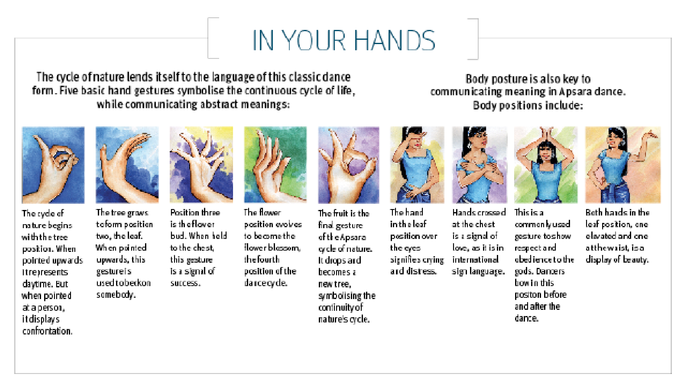
Phin is a cozy, jazzy coffee bar founded by award-winning barista, Andrew. He wanted a bold and playful logo (and brand) to match his experimental approach to coffee. Working together, we based Phin’s logo symbols off of traditional Cambodian hand gestures to honour his roots.
Symbol Reference

Phin
COFFEE BAR
Phin is a cozy, jazzy coffee bar founded by award-winning barista, Andrew. He wanted a bold and playful logo (and brand) to match his experimental approach to coffee. Working together, we based Phin’s logo symbols off of traditional Cambodian hand gestures to honour his roots.
Symbol Reference

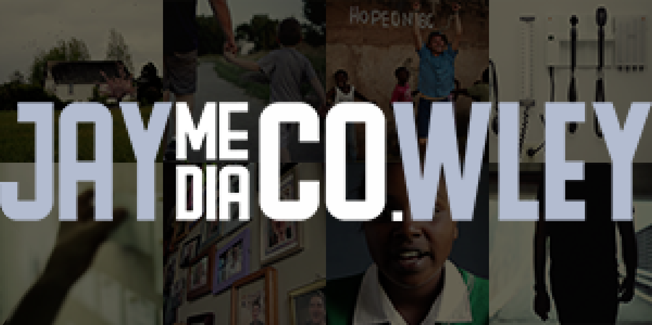
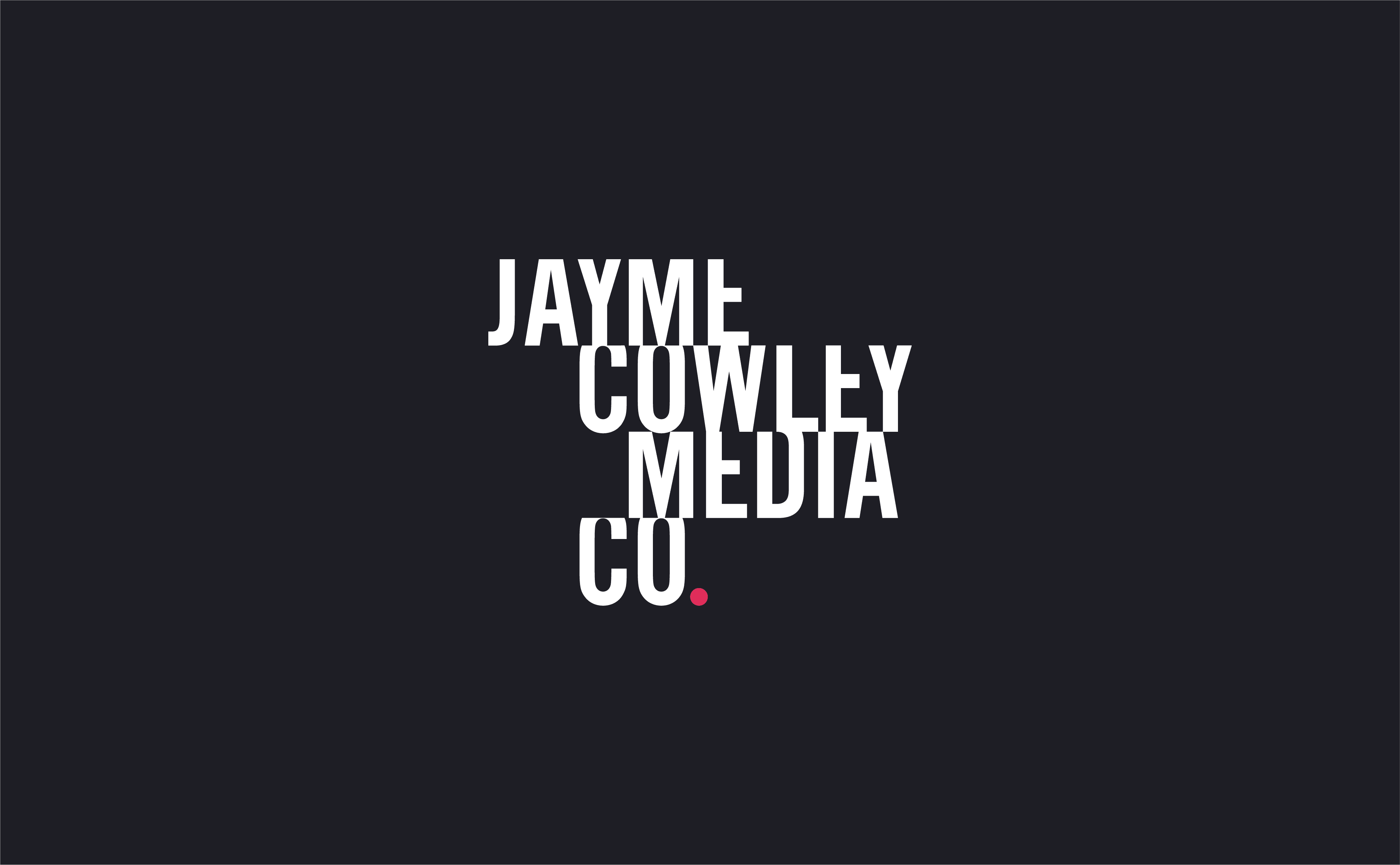
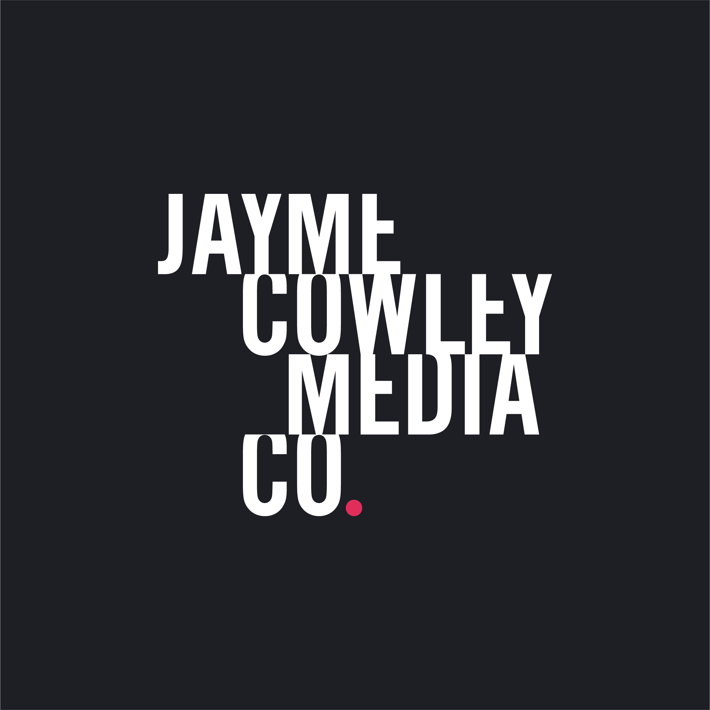
Jayme Cowley Media Co.
FILM PRODUCTION
Jayme makes beautiful videos. His work is sharp, smart, and he wanted a new logo to match. His old logo tried to be clever, but was instead just hard to read. His new logo is a proper evolution, drawing inspiration from video editing software (notice the two “ME”s and “CO”s are lined up), and the classic red recording light.
Old Logo
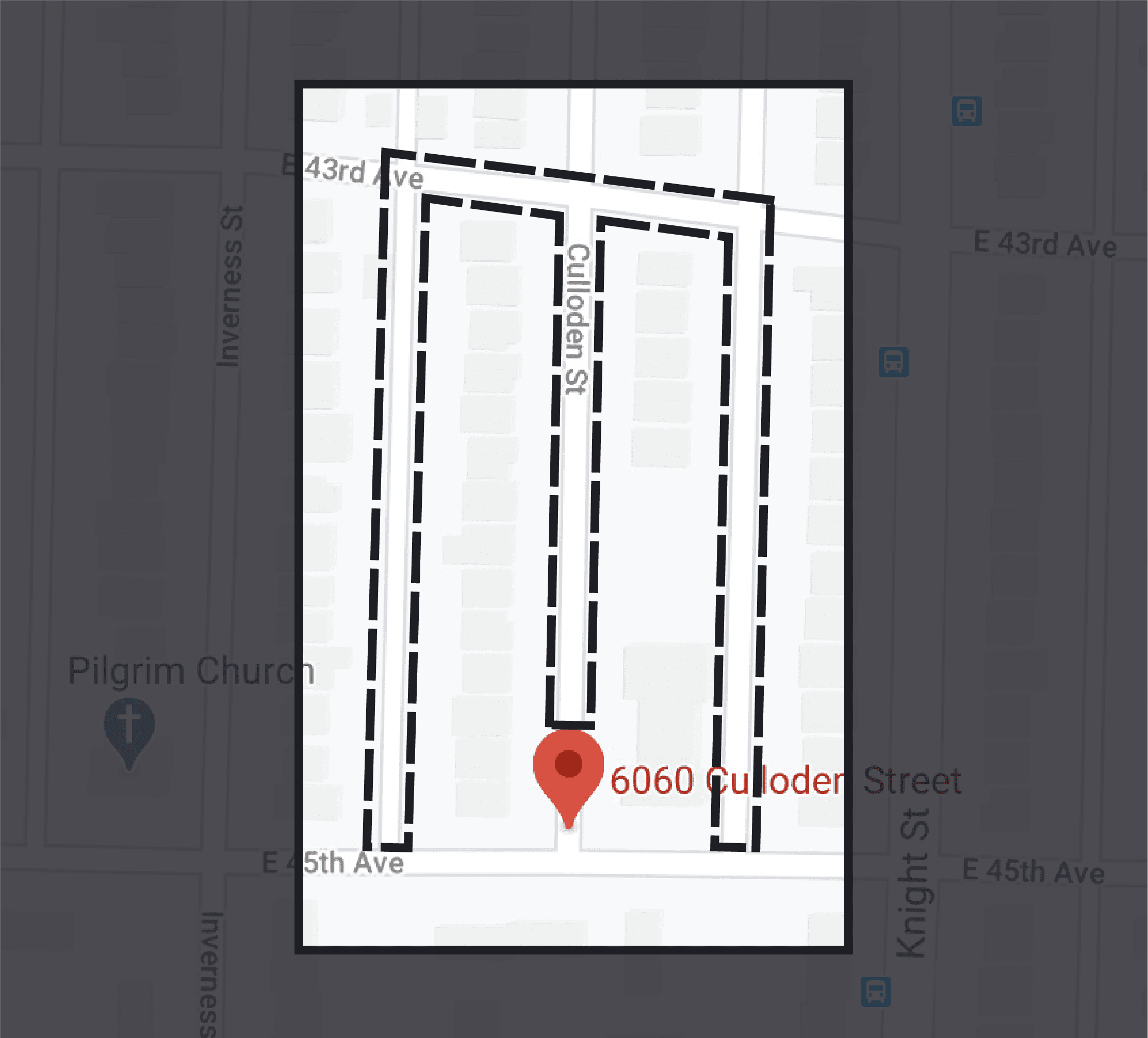
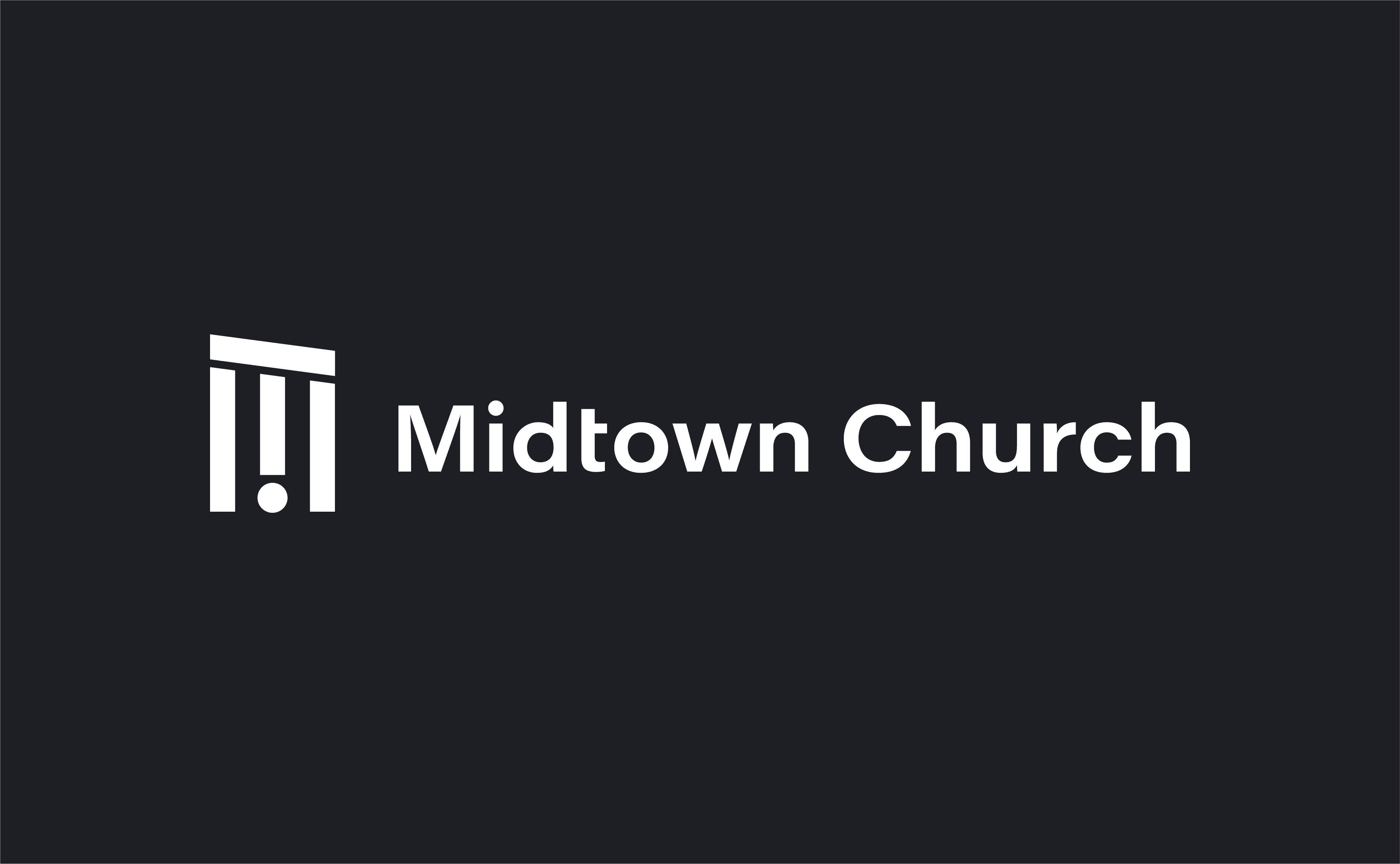
Midtown Church
FAITH COMMUNITY
Midtown is a faith community in the middle of Vancouver. Lead pastor, Norm, wanted a logo that looked clean, simple, and modern, which isn’t the usual thing for churches. Their new logo symbol is inspired by the surrounding street layout. It also symbolizes some traditional Christian imagery: a pillar, a pulpit, and a revelation (“!”).
Symbol Reference
Sara Murphy
PSYCHOTHERAPY
Sara is a brilliant psychotherapist helping people recover from trauma. Her old logo looked like a sea urchin/spider thing, so we needed to move away from that. Having a creative spirit, she wanted something unique. Her new logo symbol is designed to look like an art piece. It represents the beauty that can be brought out of chaos in a way that feels natural.
Old Logo
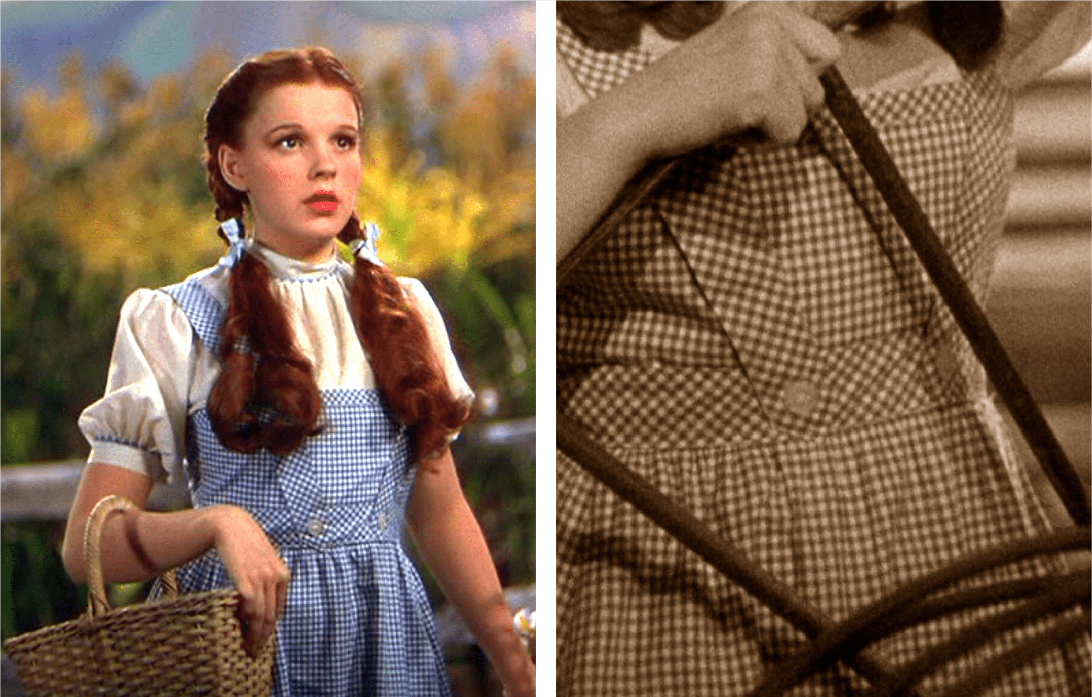
Auntie Em's Bluebird
BODY PRODUCTS
Named from the film “The Wizard of Oz”, this Vancouver-based body products shop needed a logo that communicates the good old-fashioned, grassroots nature of this small, but mighty, one-woman operation. Dorothy's classic dress pattern serves well for this, pulling the new logo together.
Pattern Reference
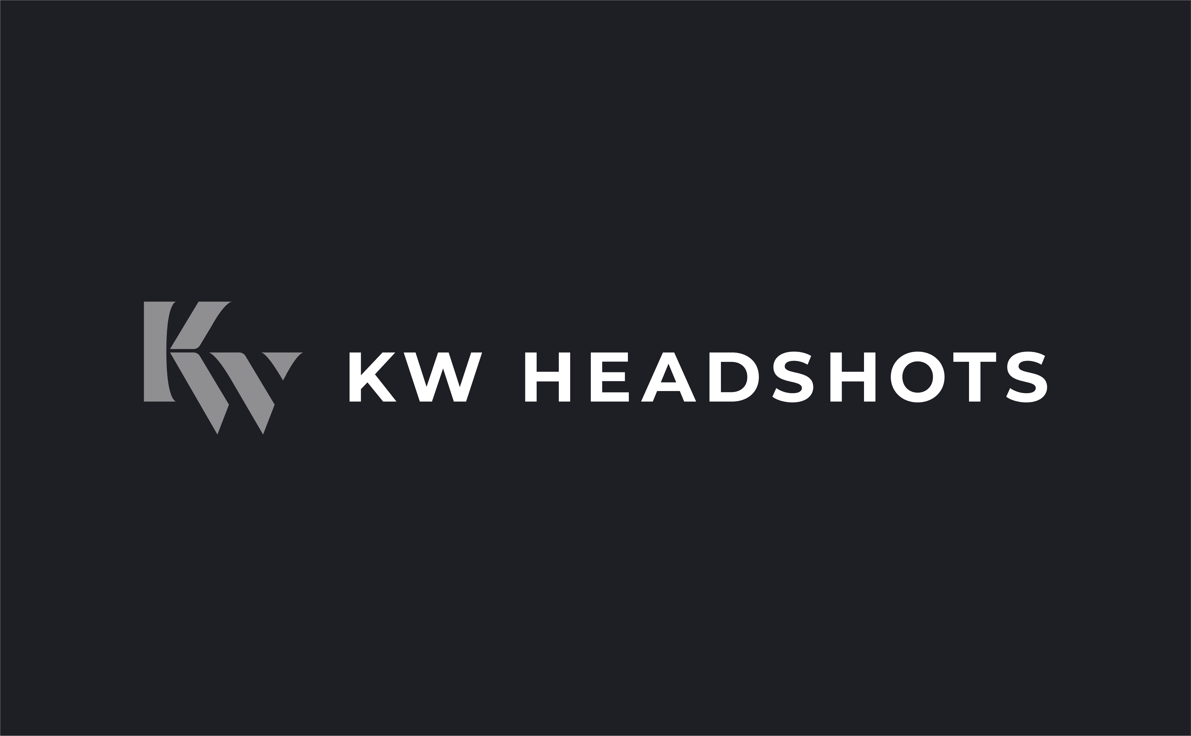
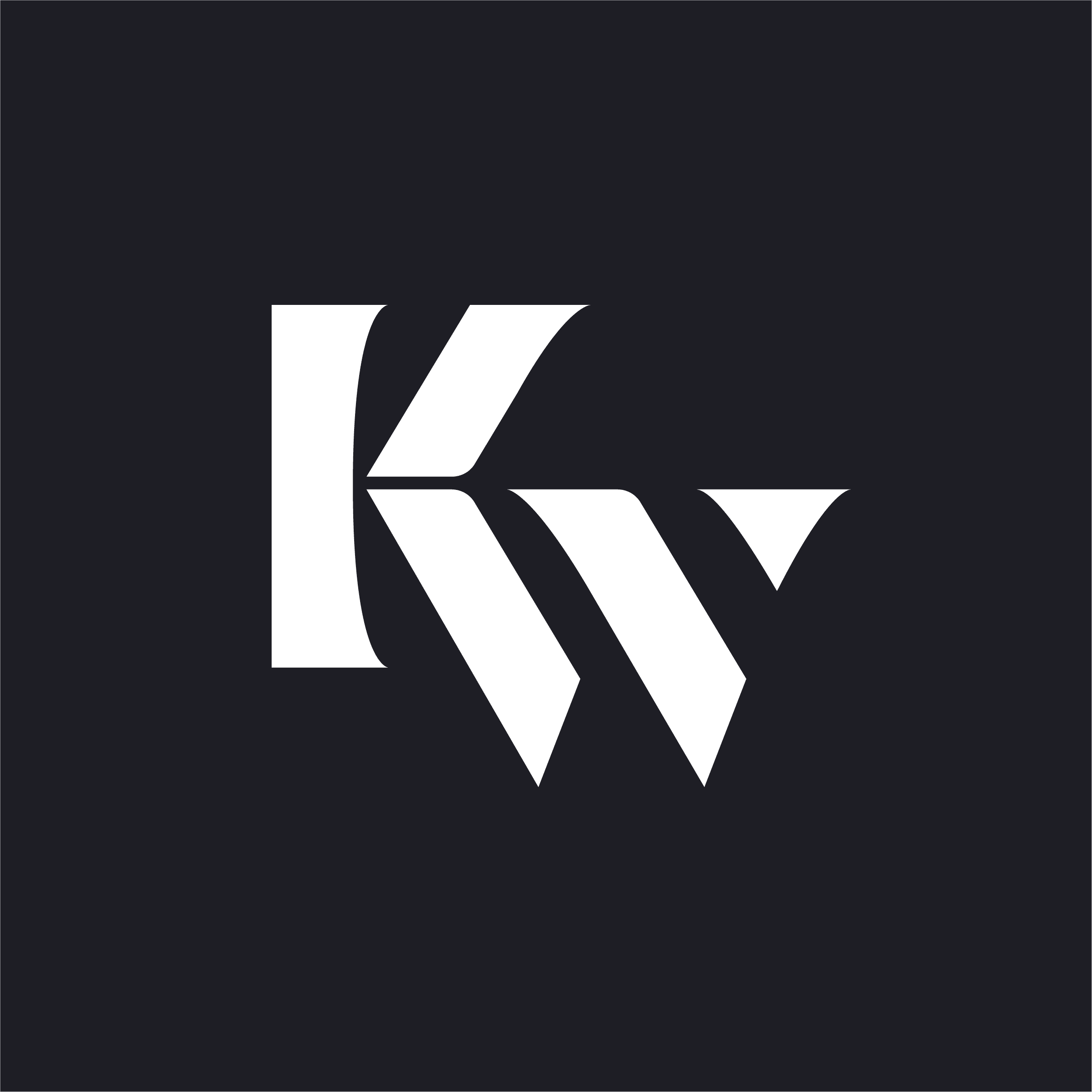
KW Headshots
CORPORATE PHOTOGRAPHY
Hannah is a great photographer, and a bright entrepreneur. She gets it: Every professional needs a good-looking headshot, and quick. Her studio provides that quick-quality, but her old logo just wasn't giving that vibe. Her new logo looks powerful and beautiful, matching how she makes her clients feel.
Old Logo
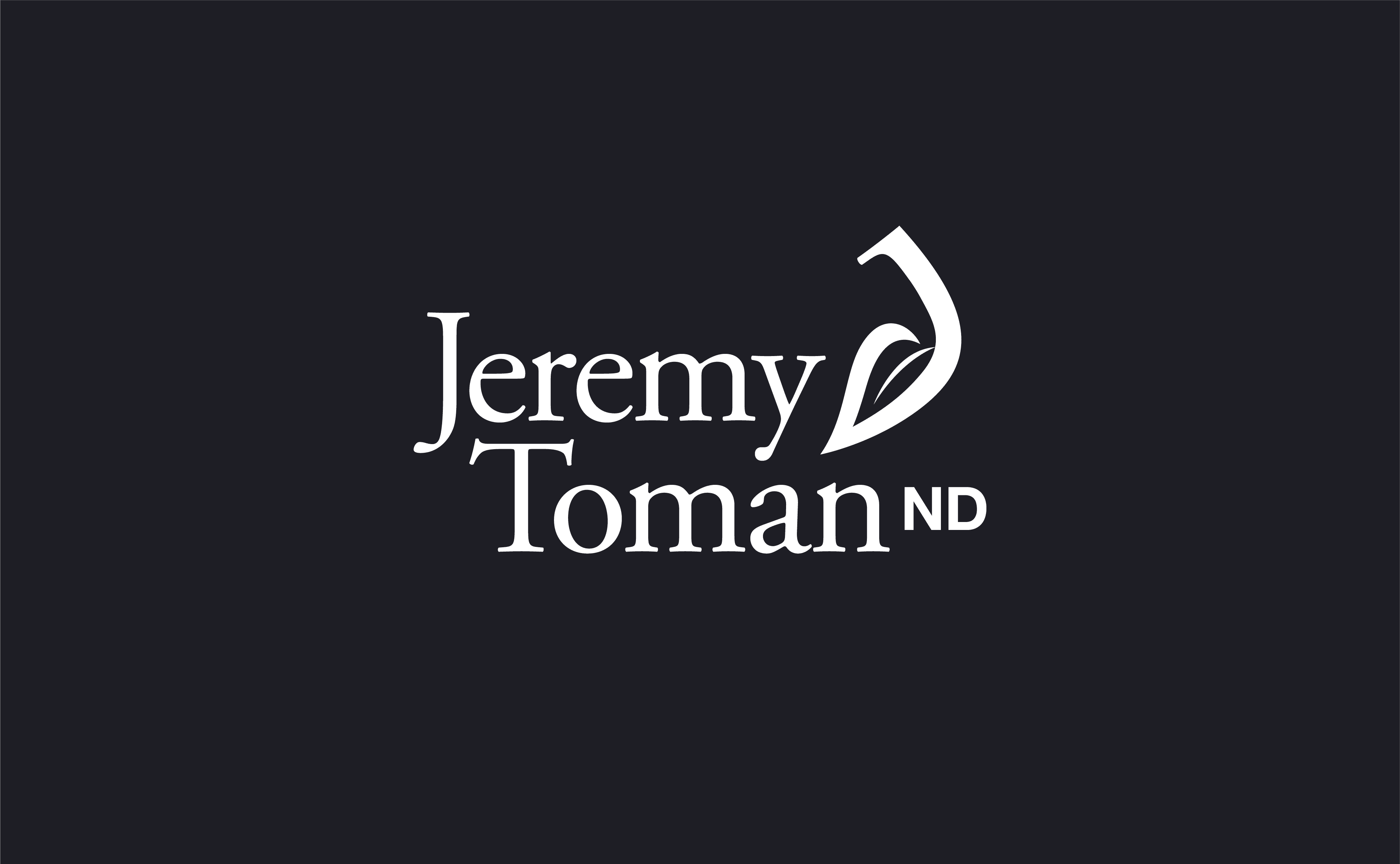
Jeremy Toman, ND
NATUROPATHIC DOCTOR
Jeremy is a doctor, but not the big pharma kind. He specializes in natural medicines and self-healing. He wanted a logo that expresses his practice in a way that feels natural and friendly. Like him.
Symbol Reference

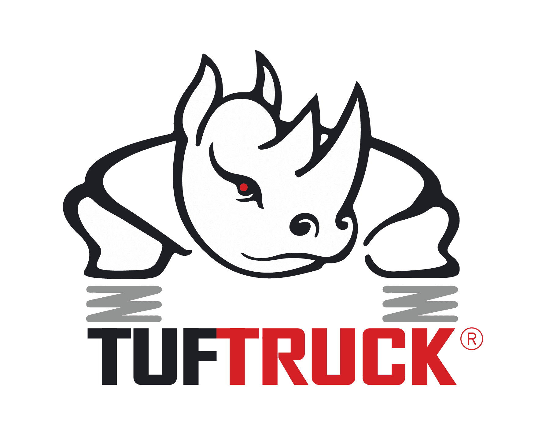
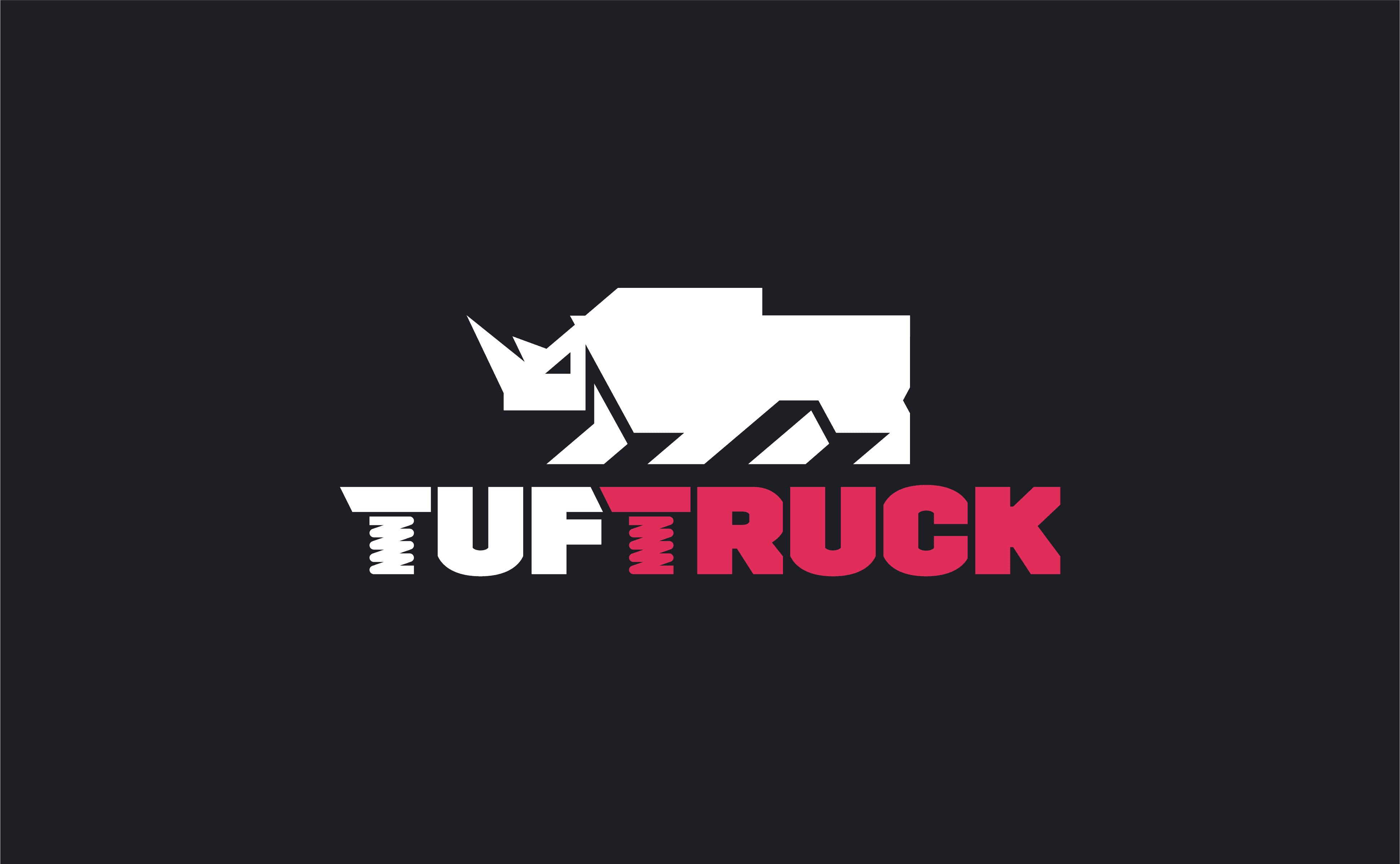
Tuftruck
HEAVY-DUTY SUSPENSION COILS
Tuftruck makes upgrade suspension coils to prevent trucks from sagging when there’s a heavy load to carry. Obviously, Tuftruck needs to look ‘tuf’, but their old logo looked like clipart. Their new logo looks powerful, and has quickly become popular among new customers (people asking for stickers, merch, and stuff like that).
Old Logo
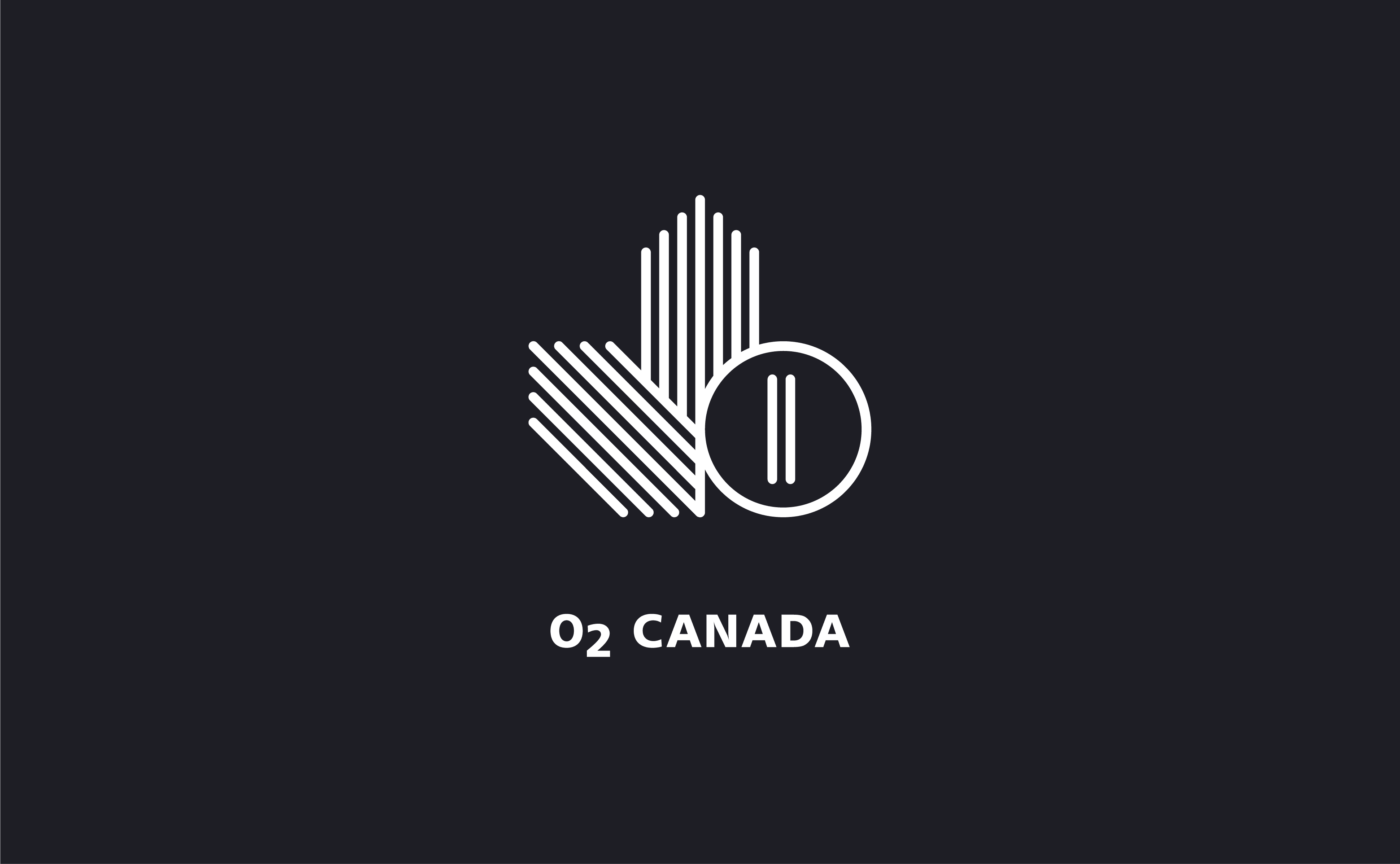
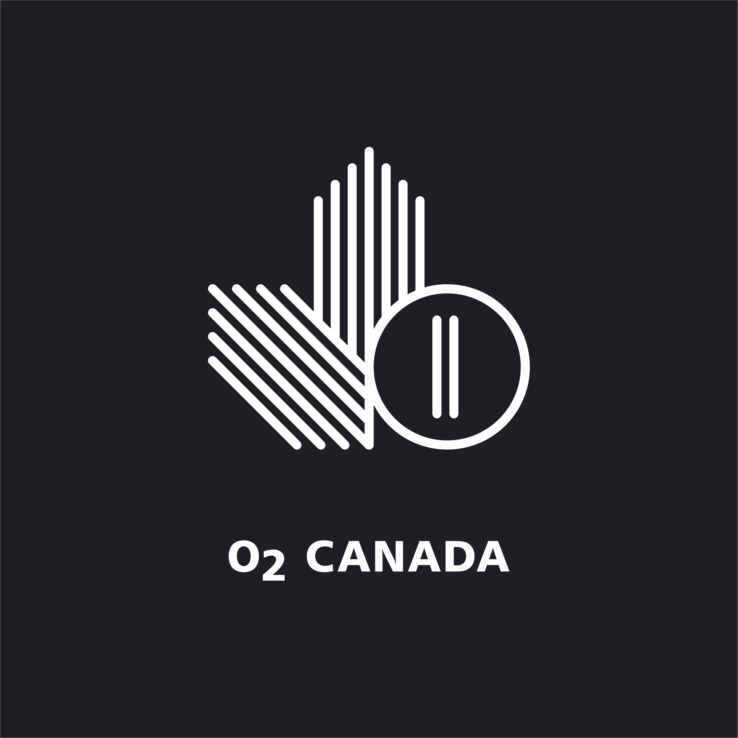
O2 Canada
APPAREL
At an eye-watering $80/mask, O2 Canada wanted a new logo to secure their market position as a high-performance apparel brand. Just as Nike’s logo isn’t a shoe, and Arc’Teryx’s isn’t a jacket, same goes here: Instead of featuring a face mask within the logo, I designed a mark that’s just smart and sophisticated.
Old Logo

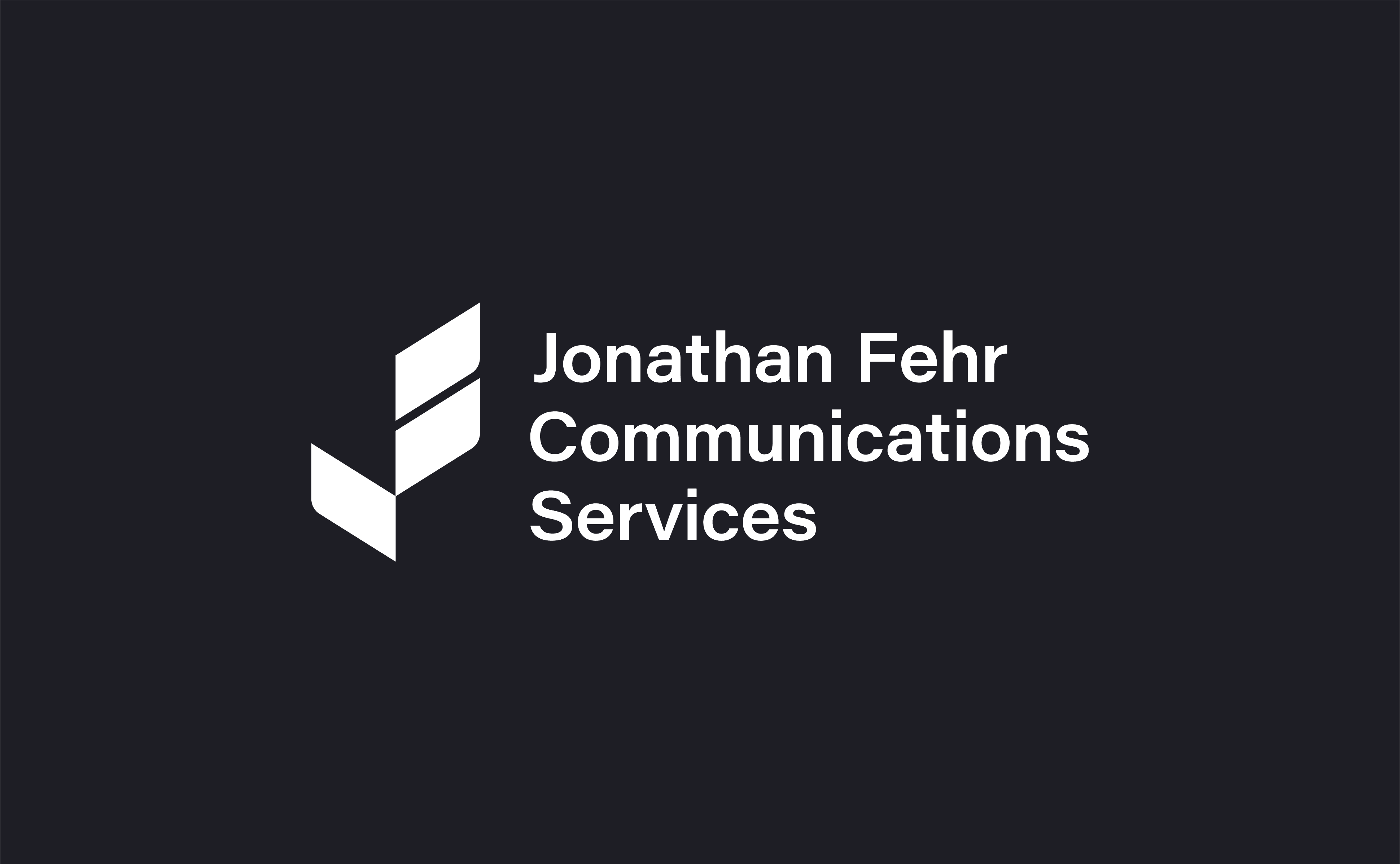
Jonathan Fehr Communications Services
PROFESSIONAL WRITING
Jonathan writes brilliantly, and, man... Am I pumped that he’s starting his own writing studio! Simply put, he wanted a logo that speaks the way he does: clear and clever. His new logo symbol looks like punctuation marks, and brought together makes for a well-balanced monogram.
Symbol Reference
Venn
REVENUE OPERATIONS
Venn helps you make smart moves with your money. That’s, of course, if you’re a business with pre-seed or Series A funding. So, you’ve got the money... Now what? Venn makes it clear. And they wanted a logo to match that energy: Clean, clear, with absolutely no-nonsense.

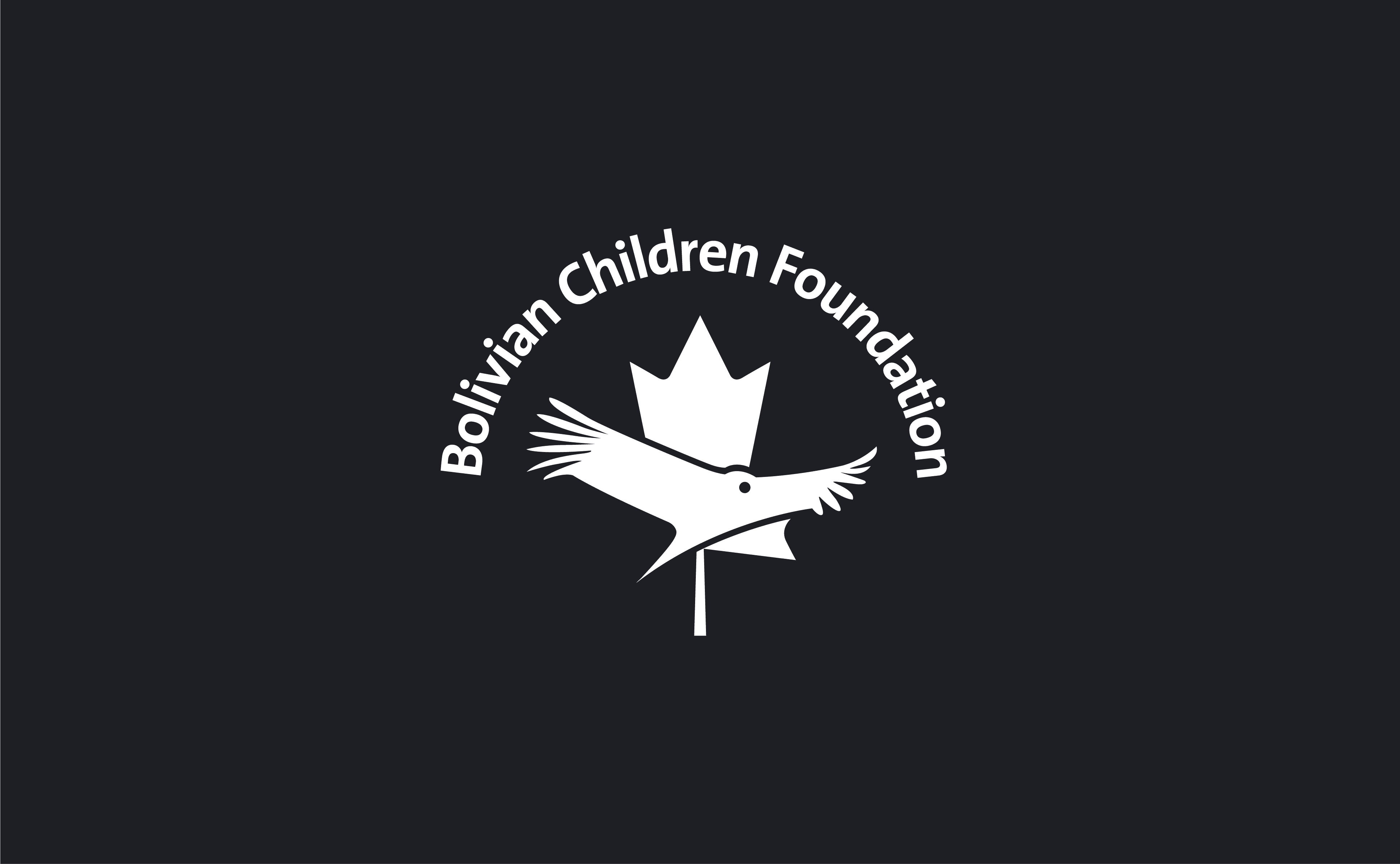
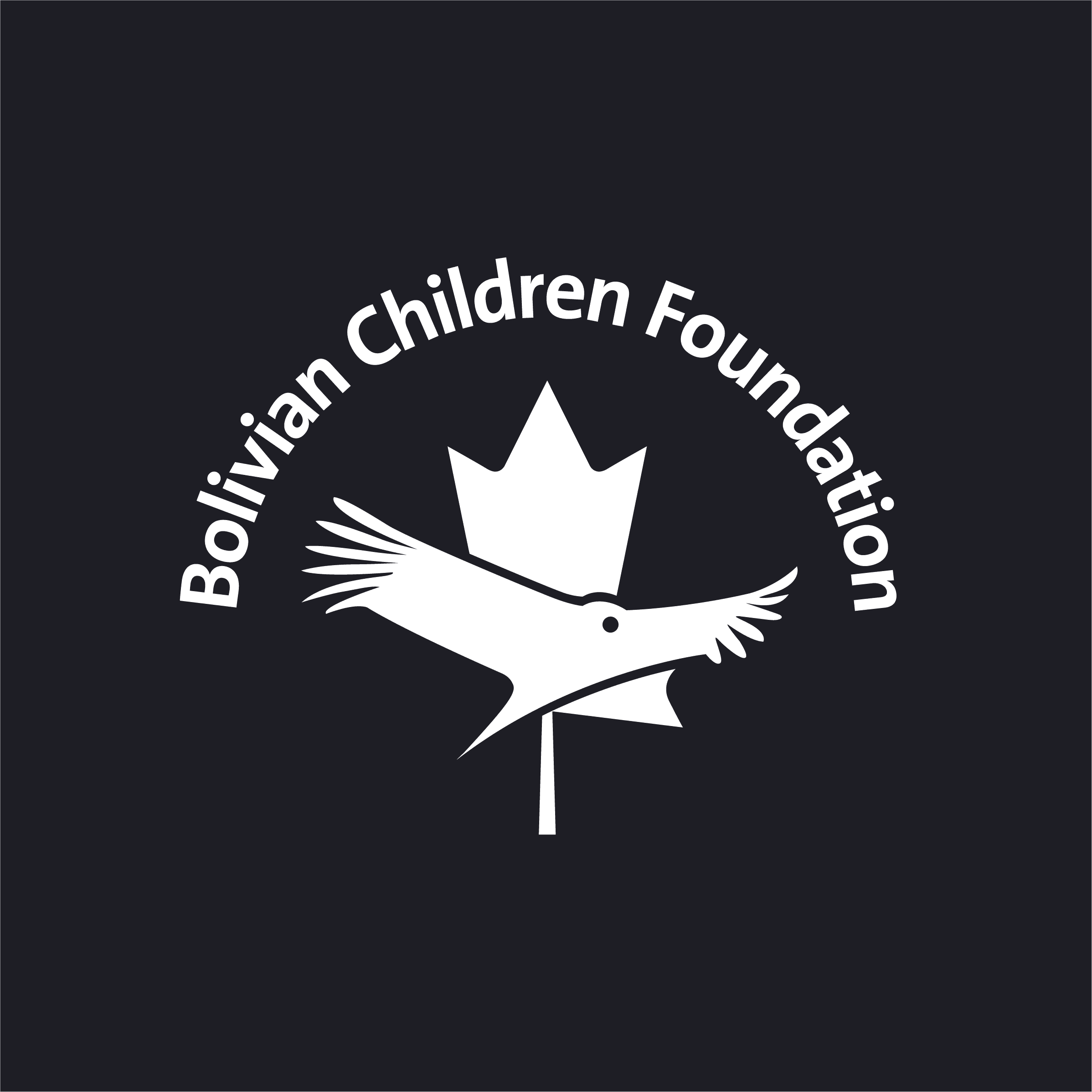
Bolivian Children Foundation (BCF)
CHARITY
Small charity. Big heart. Great idea. BCF wanted a logo that represents their official status as a Canadian-Bolivian charity. Canada’s maple leaf plus Bolivia’s national bird, the Andean Condor, cleverly presents their official connection, all while looking clean and trustworthy.
Symbol Reference

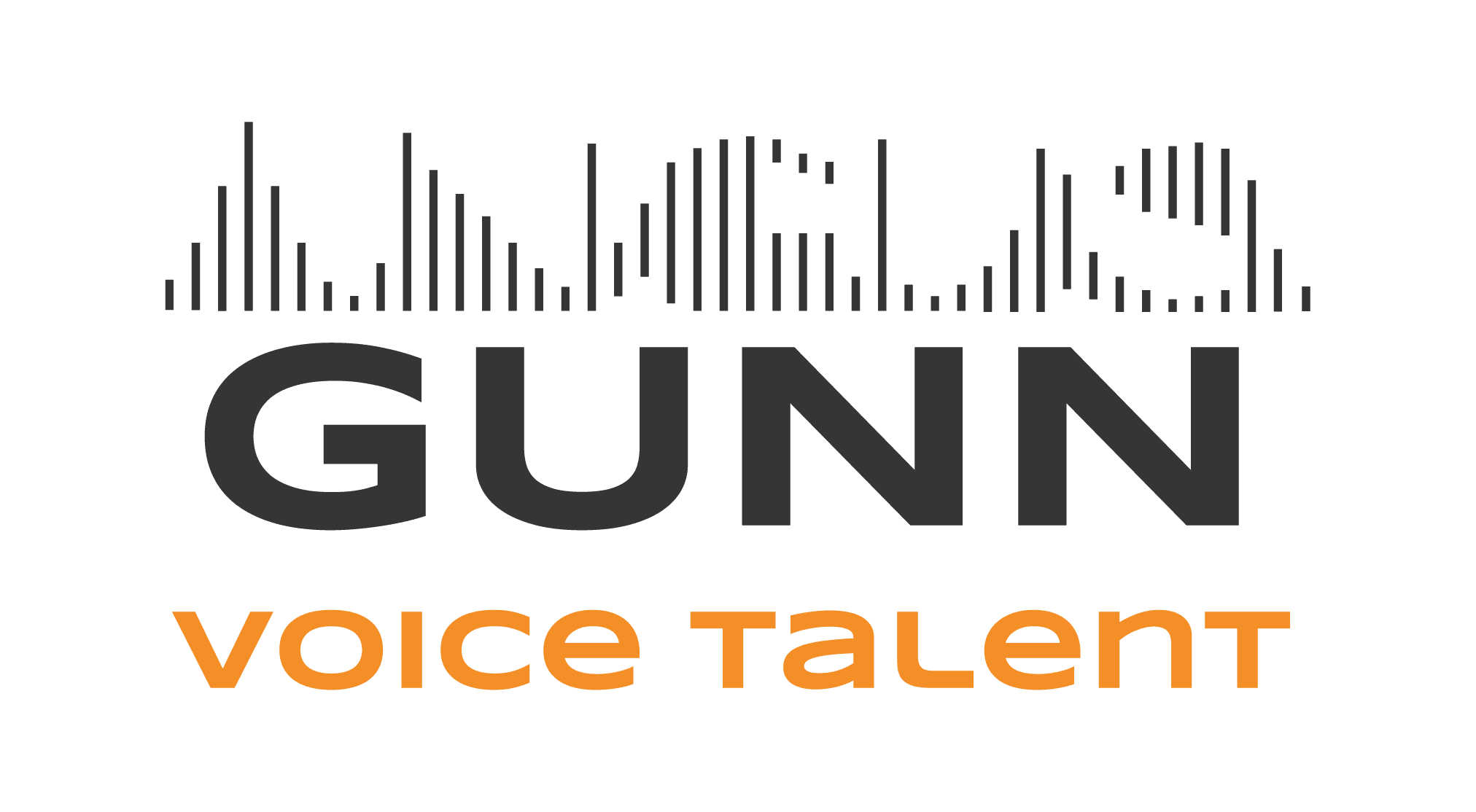
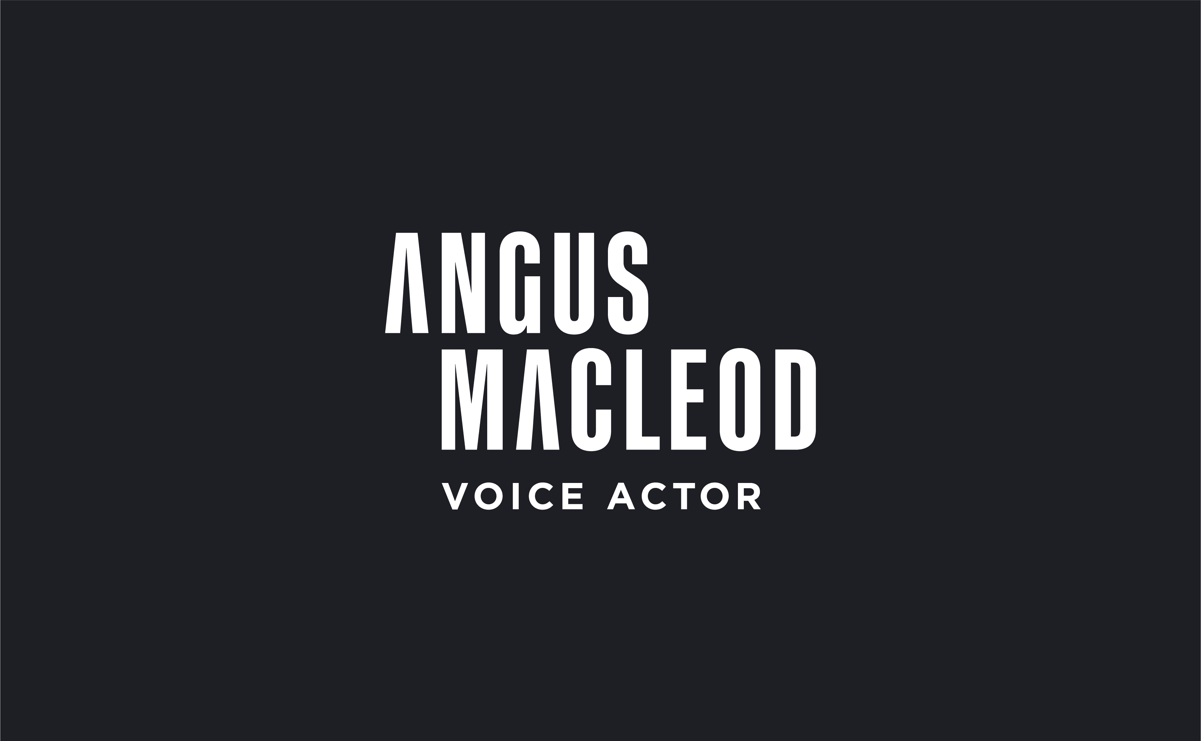
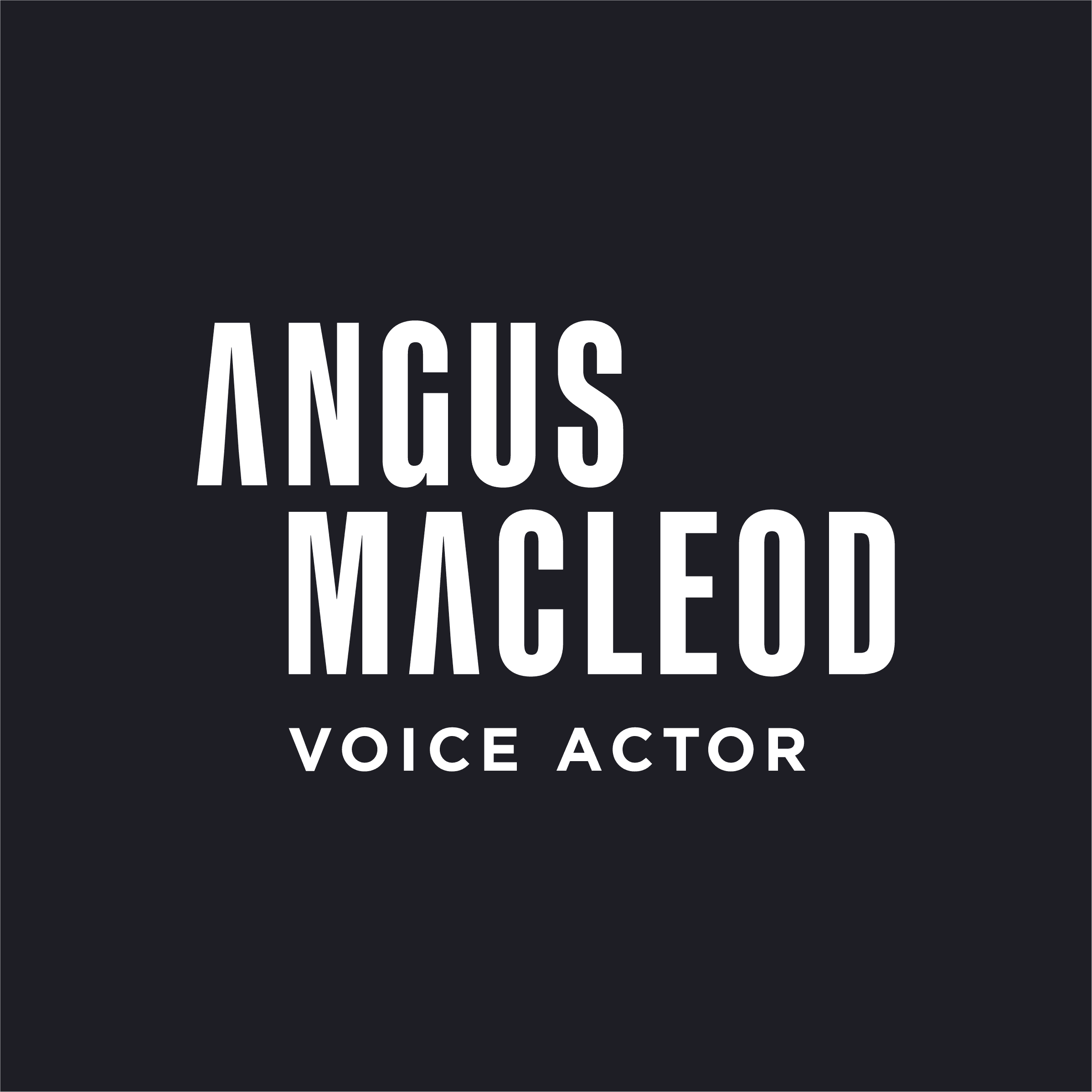
Angus Macleod
VOICE ACTOR
Angus is the man for the job. Voice over jobs. Premium ones. Okay, truly, if your business of any kind needs a trustworthy baritone (think soothing ‘safe dad’ vibes), or salt of the earth (à la Sam Elliott) he's your man. He wanted a logo simple enough to work across industries, and premium enough to get noticed.
Old Logo